Capco is a global business and technology consultancy based in London. With more than 4,000 employees internationally and 25 offices in financial centres all over the world, the company, that works for 75% of the world’s global financial services and energy institutions, was looking for new blood to join their busy and enthusiastic teams.
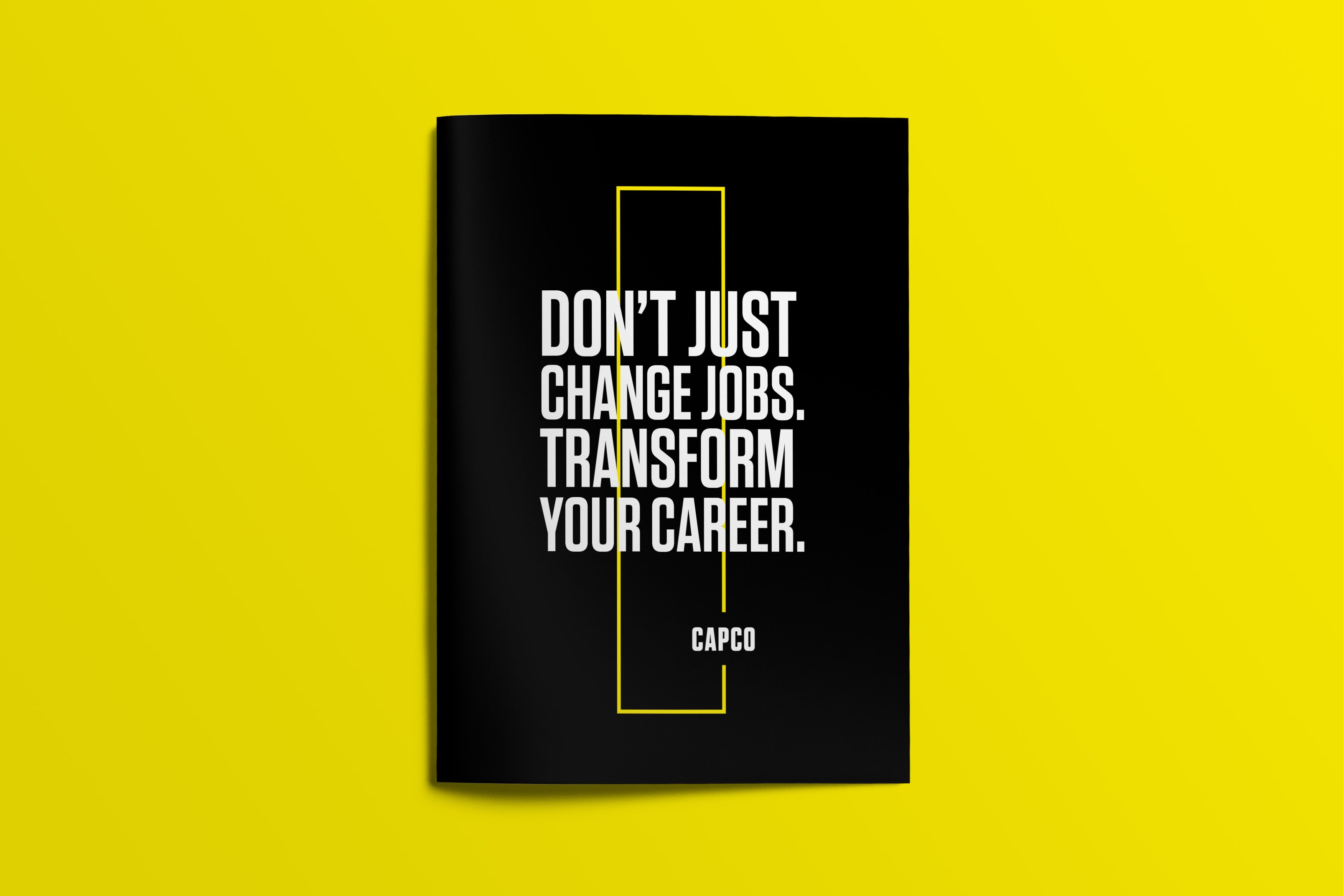
Talking to the right audience. Capco needed a brochure to attract young talents all over the world to join their business and to bring fresh, interesting and different ideas. A first conversation with the client and a look at their existing design material highlighted the need for Capco to communicate in a different way; a style that could result more attractive to that specific audience but keeping the clean and sophisticated design they developed during these years.
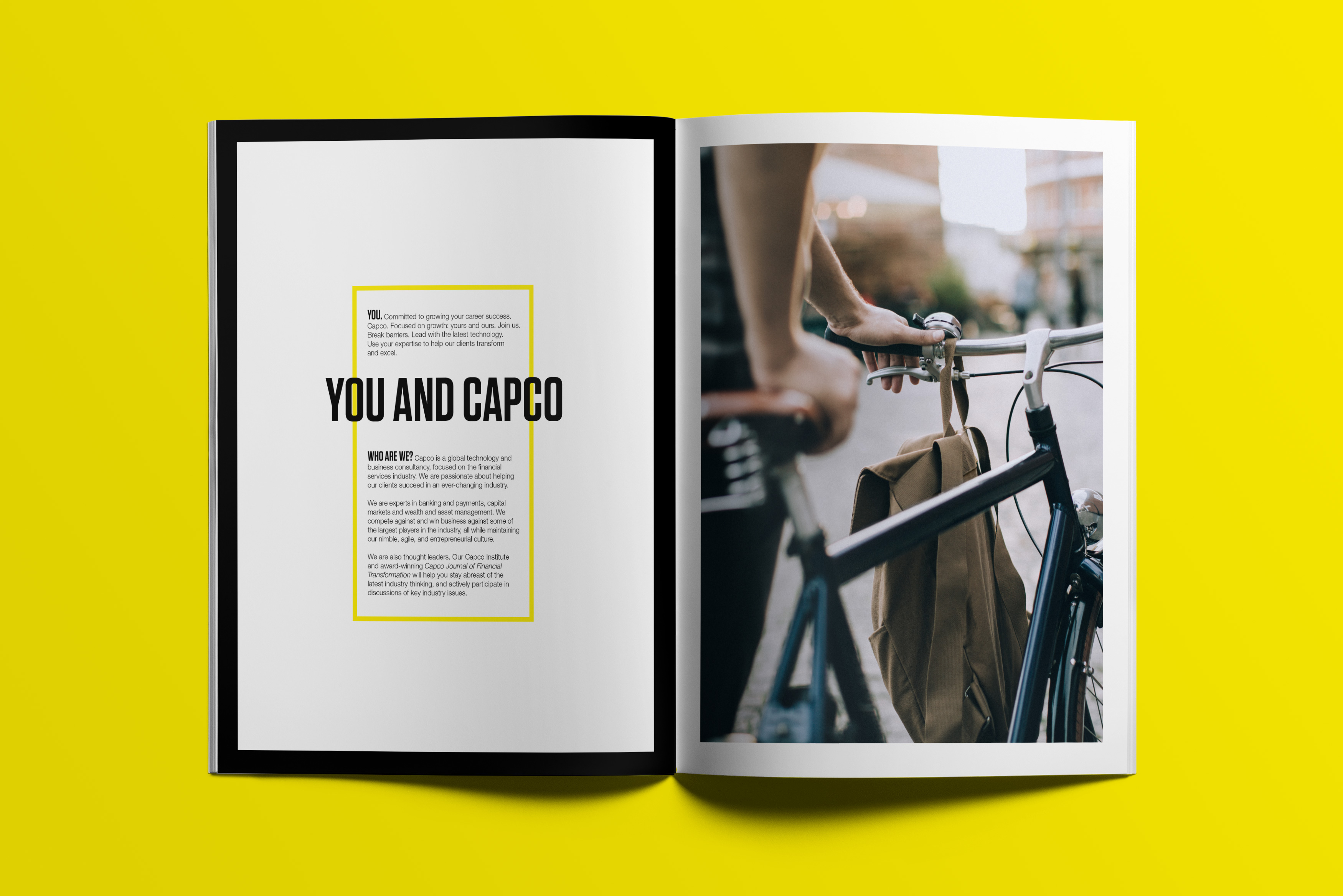
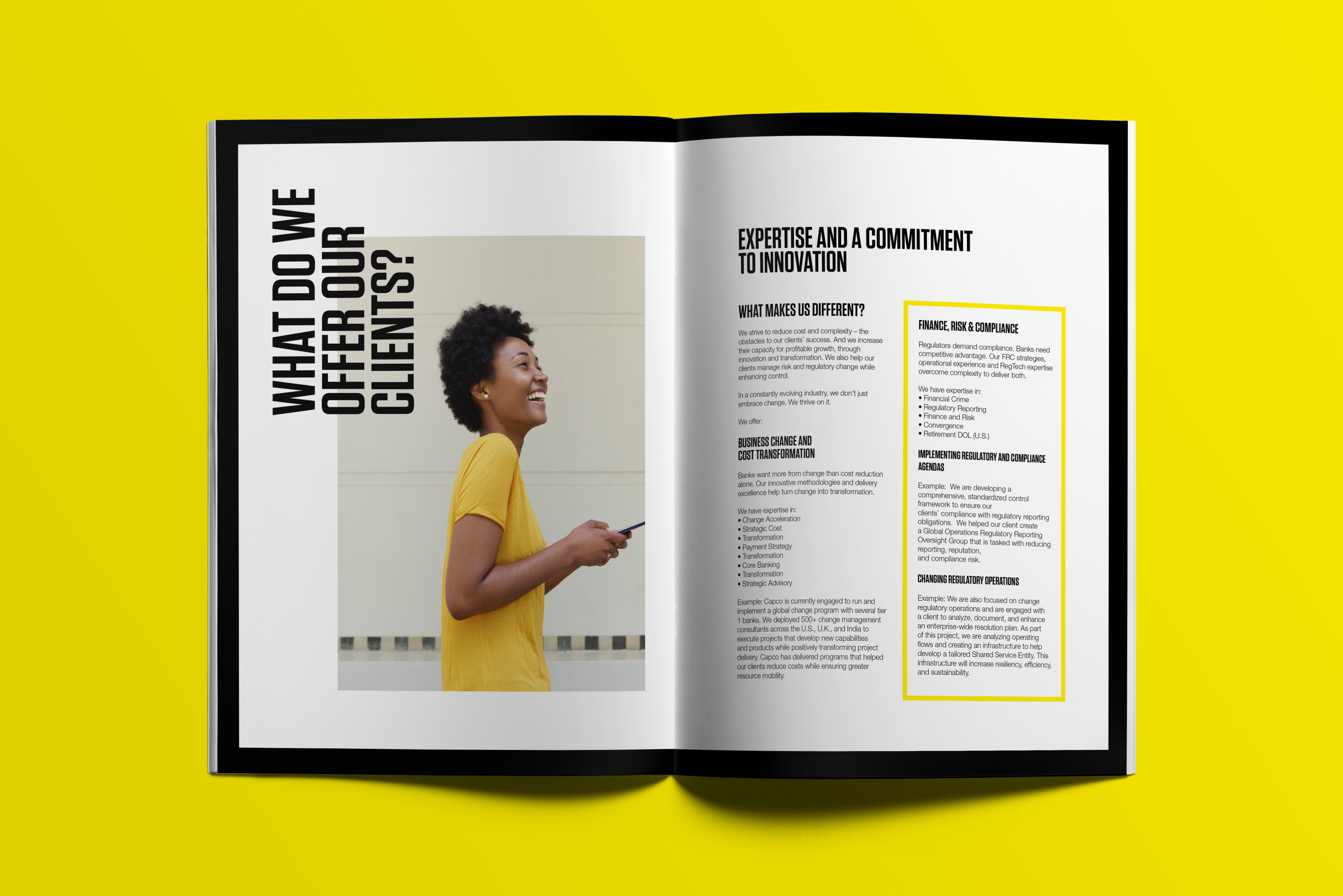
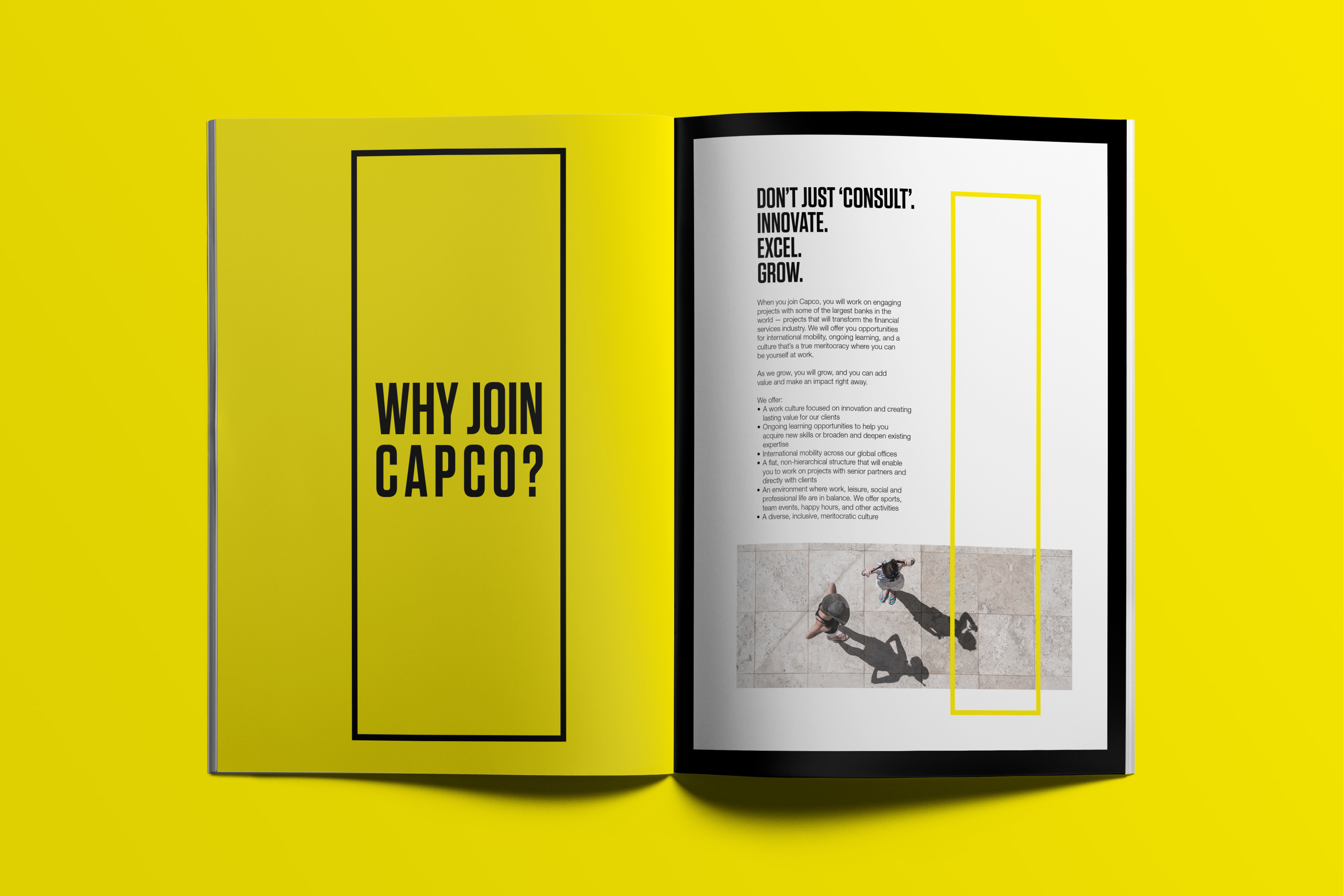
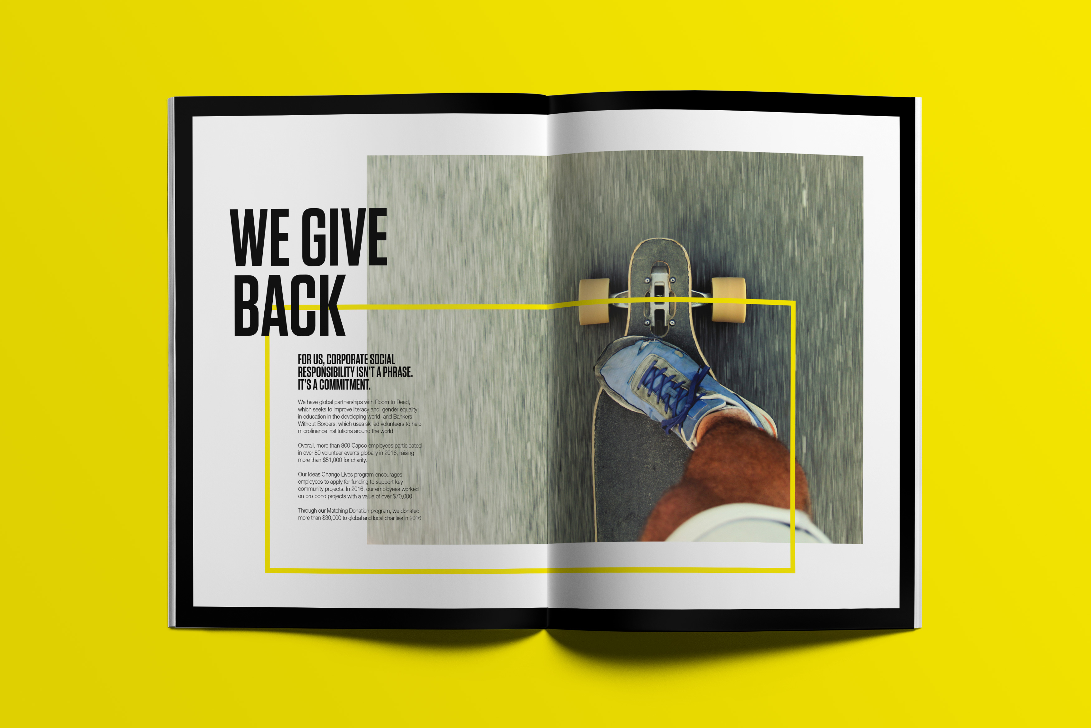
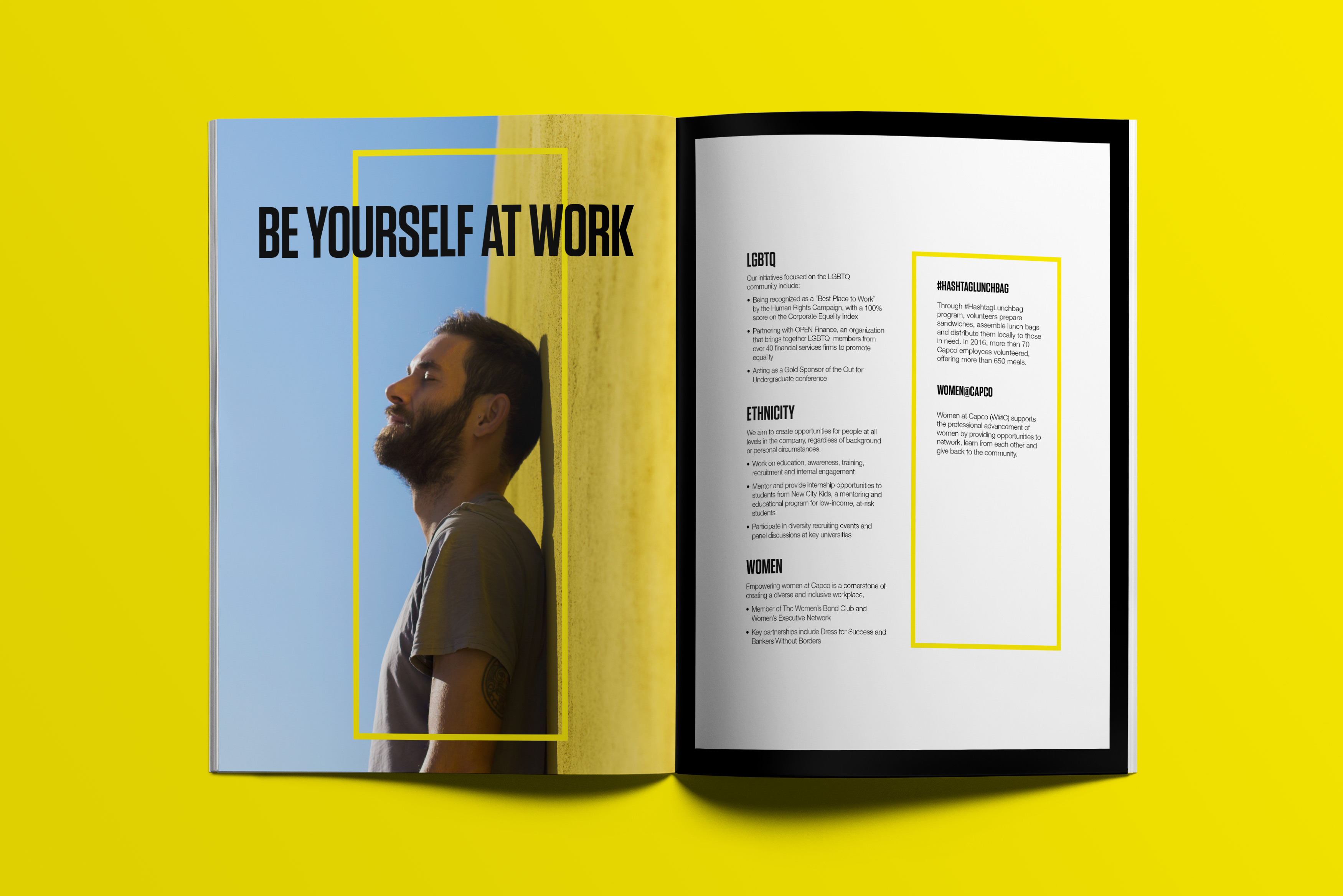
Bringing colour to the brand. Capco had a clearly defined visual style, with a very soft colour palette, plenty of white space and images that, although really stylish, were absent of emotion and personality; and when the main audience are young people, some kind of energy needs to be inflected to catch their attention. The first approach was introducing a very strong yellow tone to their existing guidelines, filling that space that Capco was lacking, and adding freshness, happiness and positivity to the brochure. In contrast, thick borders and big headlines in black were giving the stability and strong point of view of a company with more than 20 years in the business.

Portrait made right. As a second approach, images needed to show more emotion. In their own words, Capco is “a vibrant community of empathetic, creative and rational personalities”, but the images were not reflecting those values or speaking to the right audience. Moving away from the architectural and minimalistic perspective that the company developed in the past was a necessary step to show the excitement and satisfaction of working at a company like Capco. For that reason, the emphasis was put on emotion and youth, not on the corporate side, allowing the company to be less literal while expressing themselves and their focus through images.


