What does success mean? Looking at the dictionary, the official definition is “achieving the desired aim or result”. Most of the time we assume -and I’m conscious we all obviously want to get first to the finish line- it is all about winning. But couldn’t be the journey we are taking a way of succeeding too?
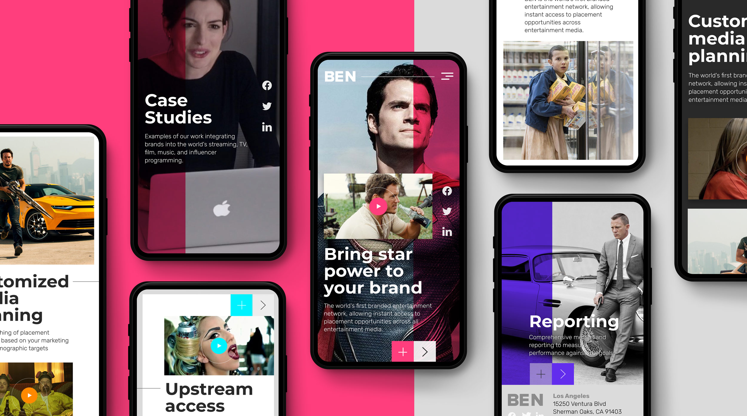
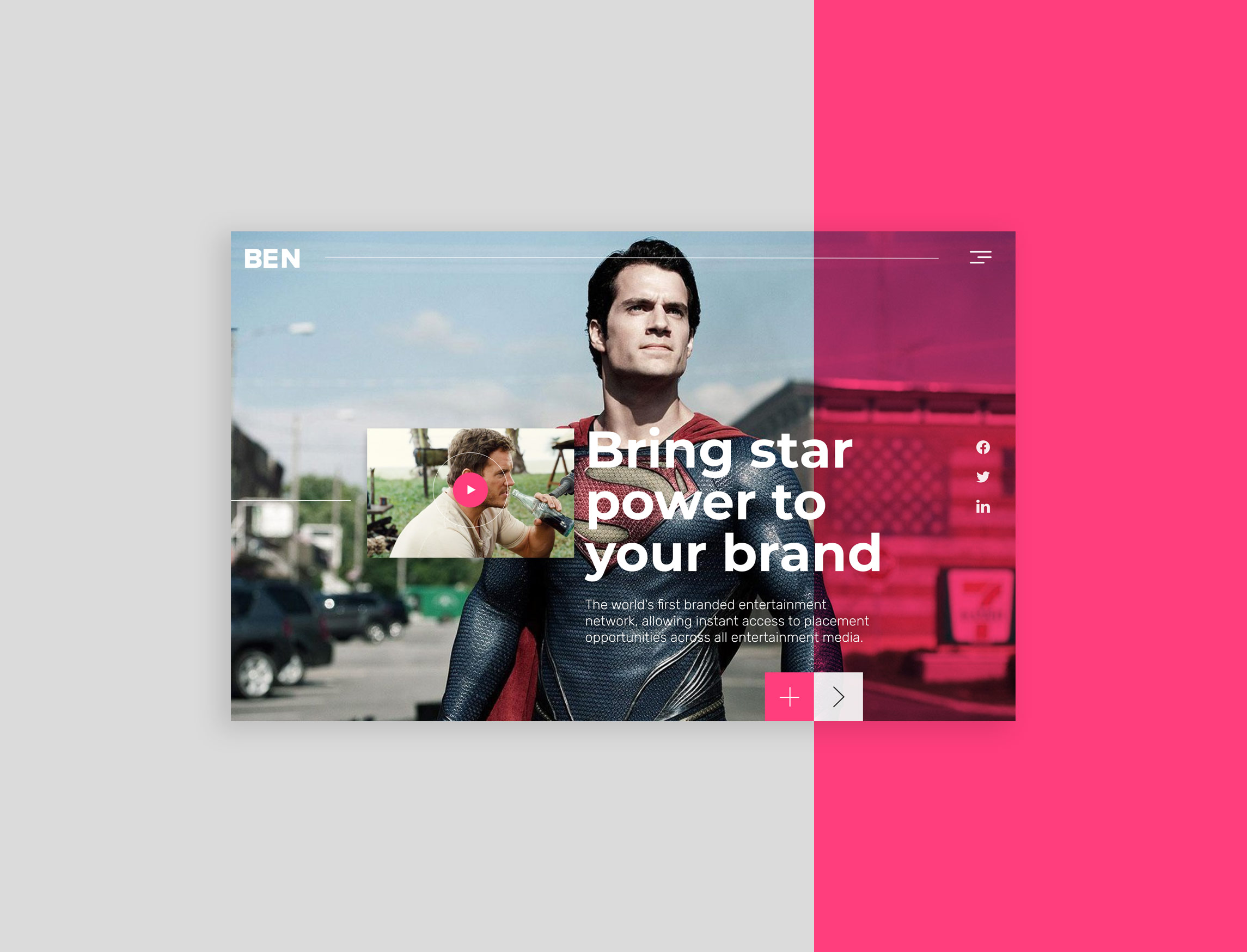
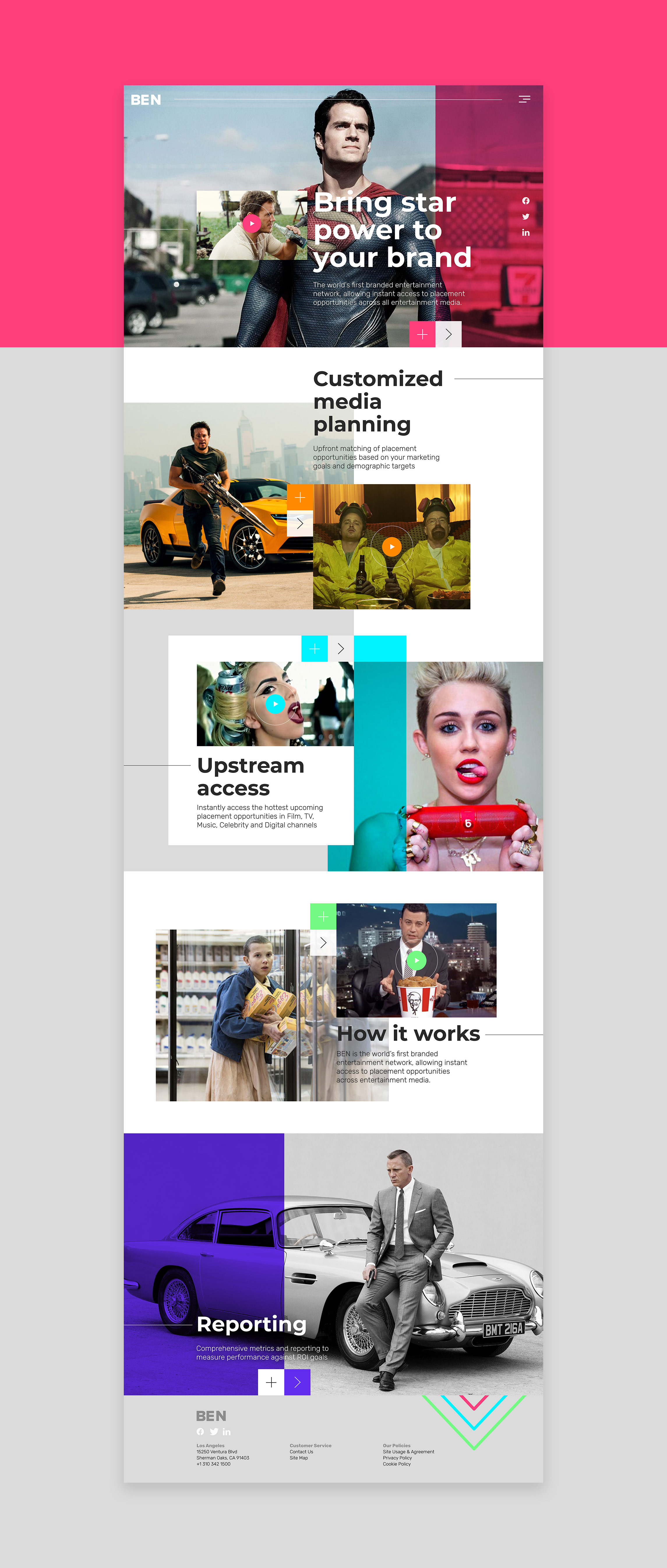
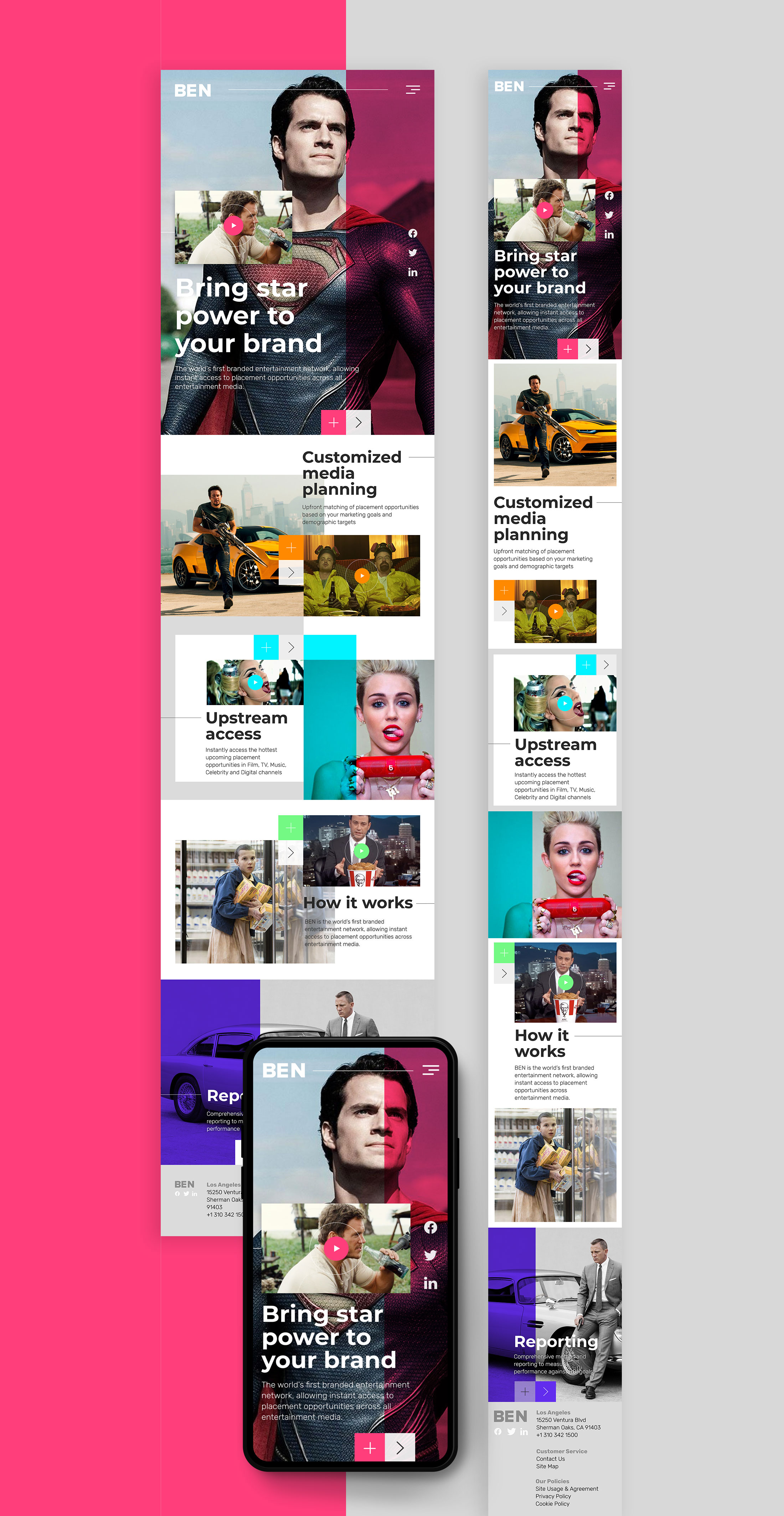
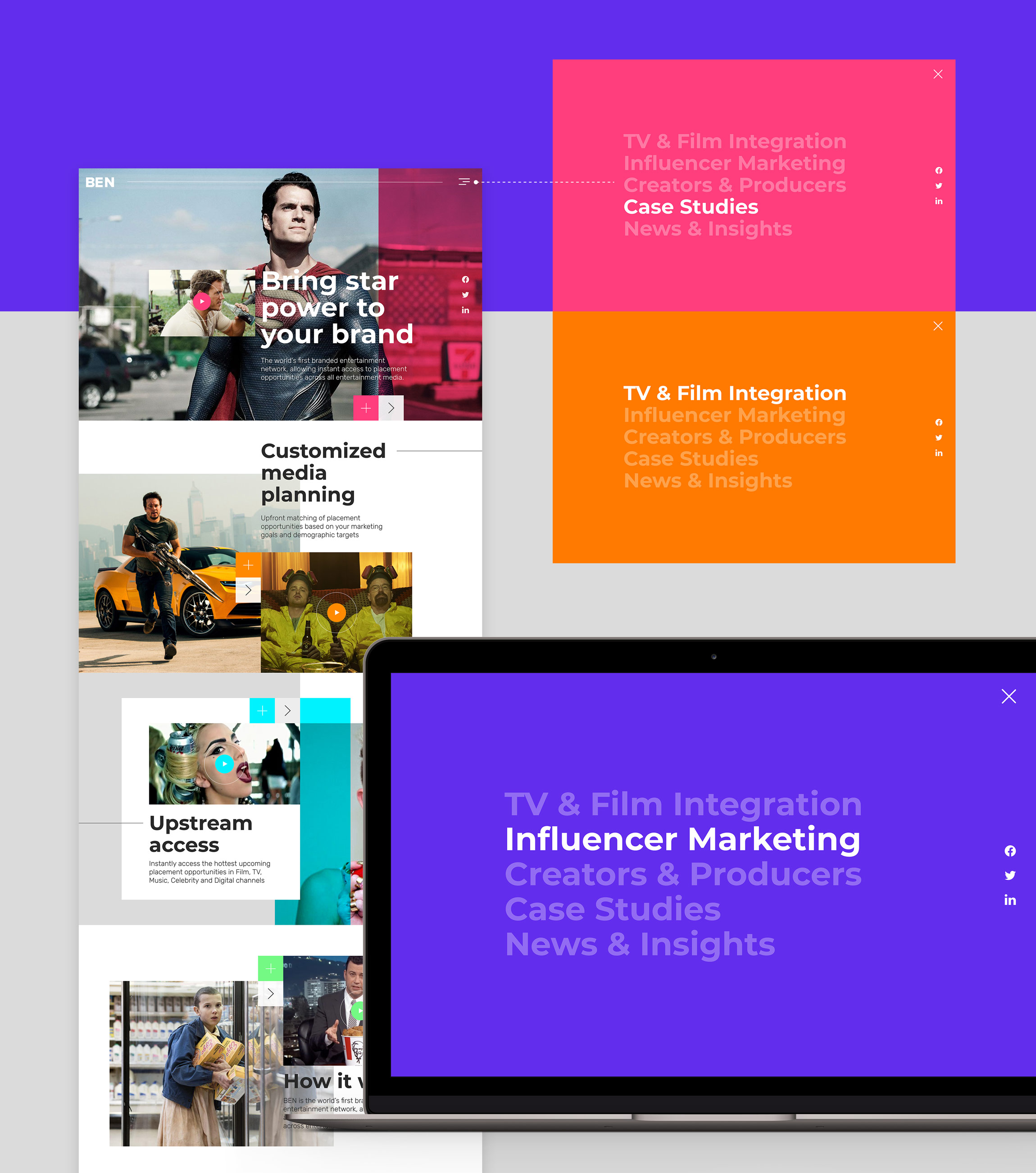
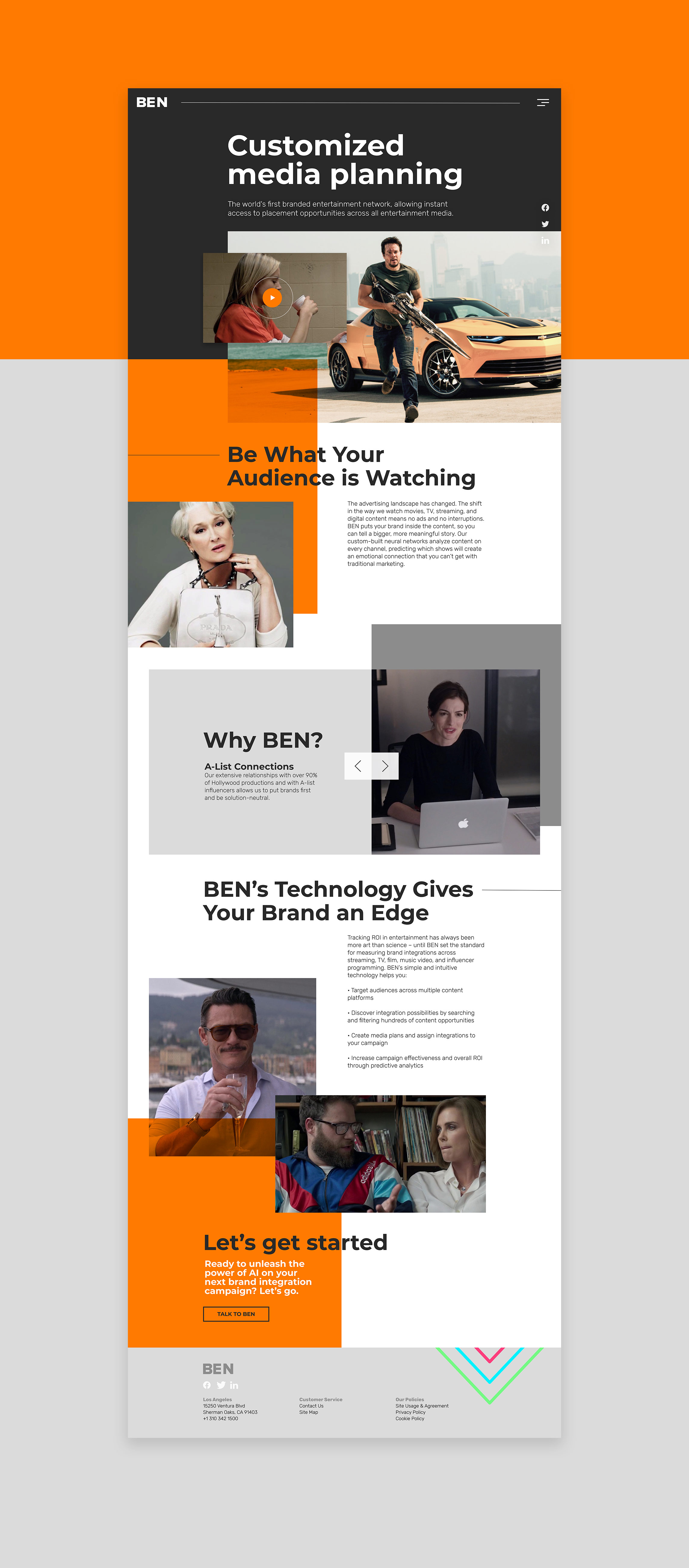
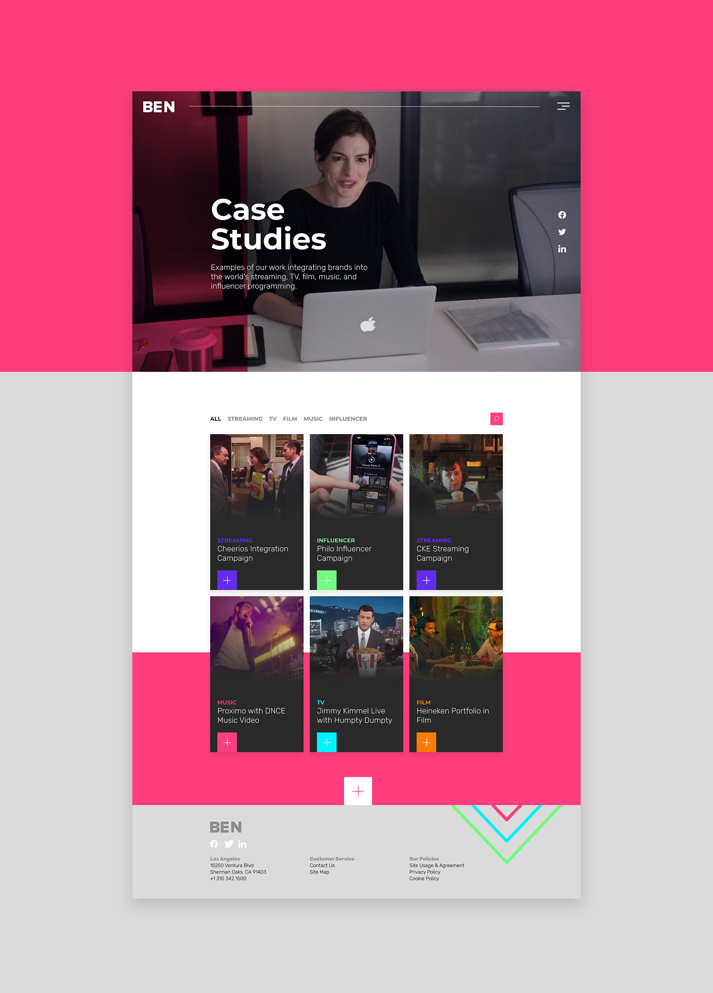
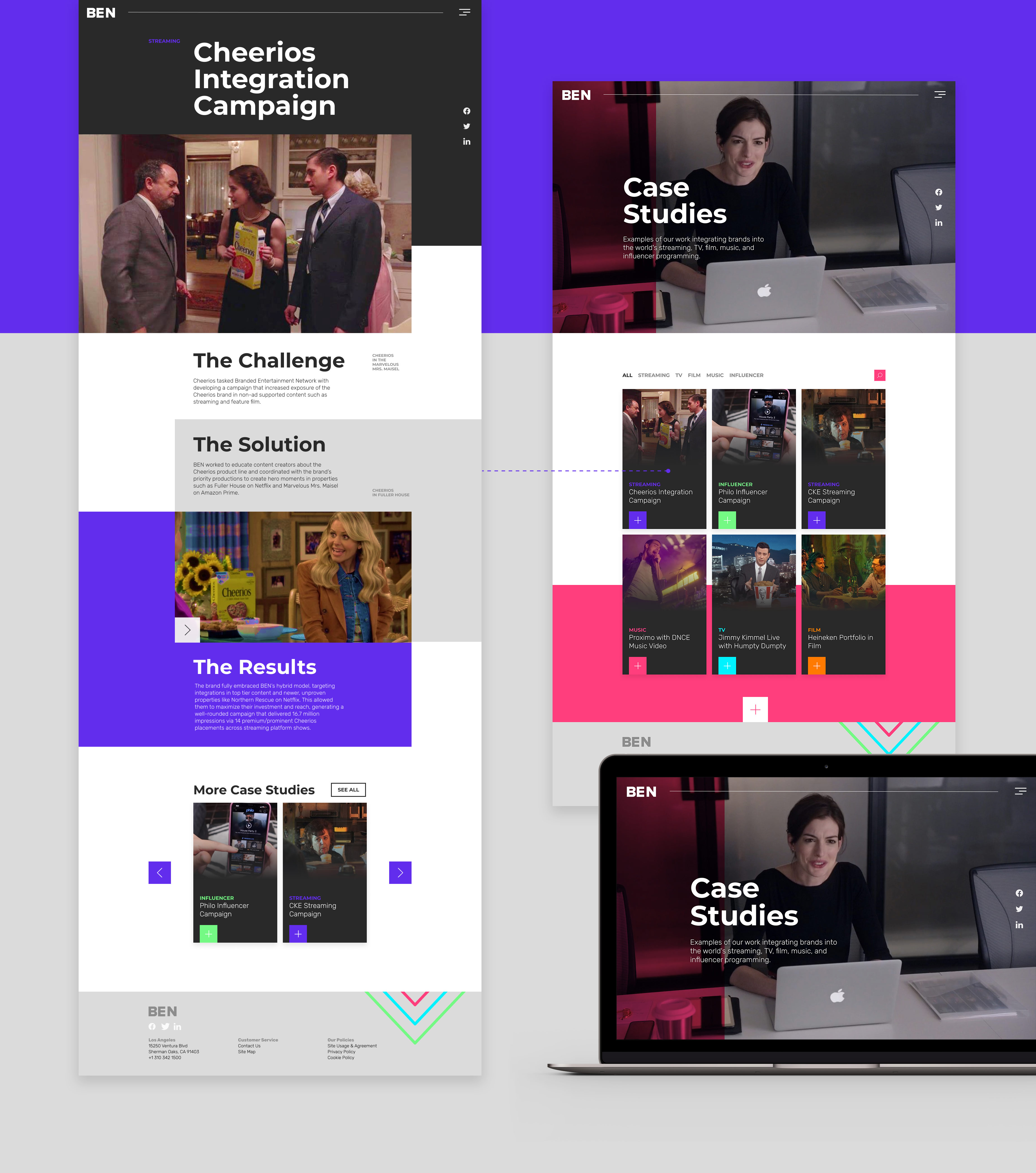
This was a pitch project and presentation created for Product Placement American company Branded Entertainment Network (BEN). The aim was revitalising their existing brand by creating a new website that was be able to attract new clients. A project that, for different reasons that are not creative related, failed to materialise. However, and although a lot of people might consider this enough reason not to show the project on their portfolios, on a personal and professional note it meant something completely different: it was about the realisation that, no matter how many years and experience I’ve had in this industry, there’s always room to learn new things and feel invigorated by them.
At the beginning of my career -and I’m taking about the good old days where everyone was obsessed with Flash websites- I had the chance to learn a lot about, what it was called, web design, including HTML, CSS and even a bit of animation and coding. However, if there’s a field that requires constant evolution and recycling is digital design. In recent years we’ve seen our screens taking every single shape and size, our experiences going deeper and more socially orientated and, from a creative and interactive point of view, websites and digital experiences have been both gone minimal and incredibly complex on equal parts. And not being constantly in touch with it can be quite overwhelming when trying to catch up with all those new trends.
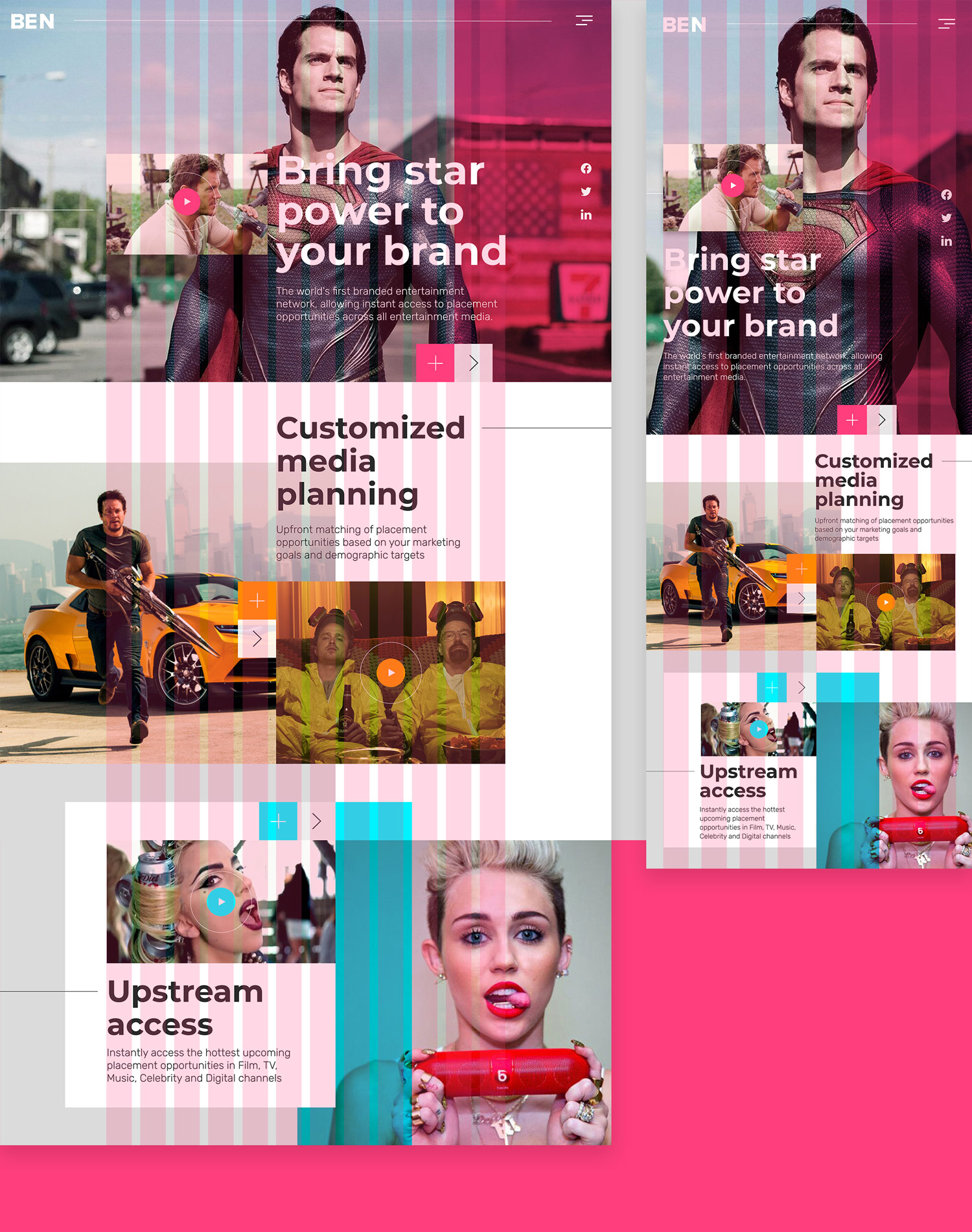
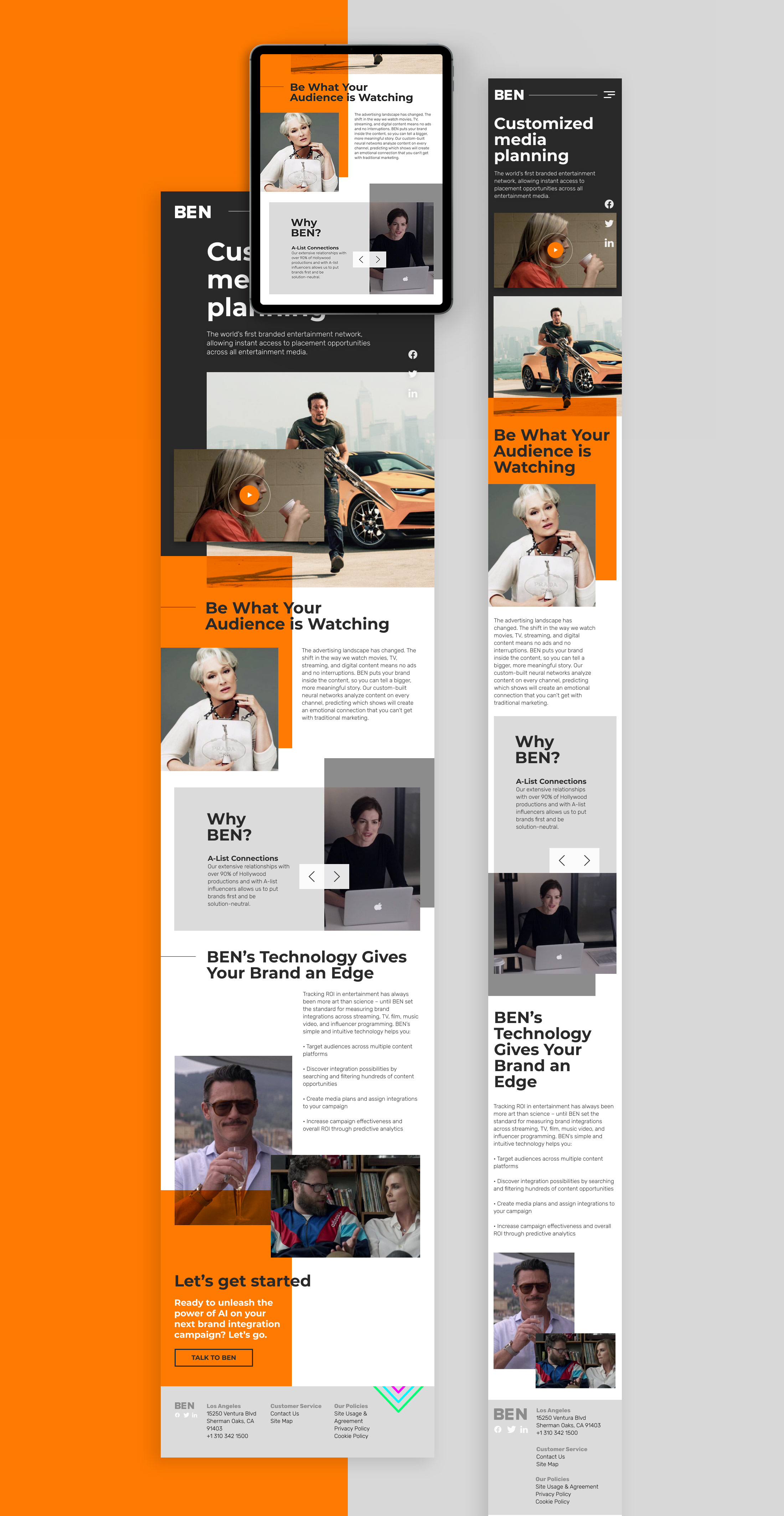
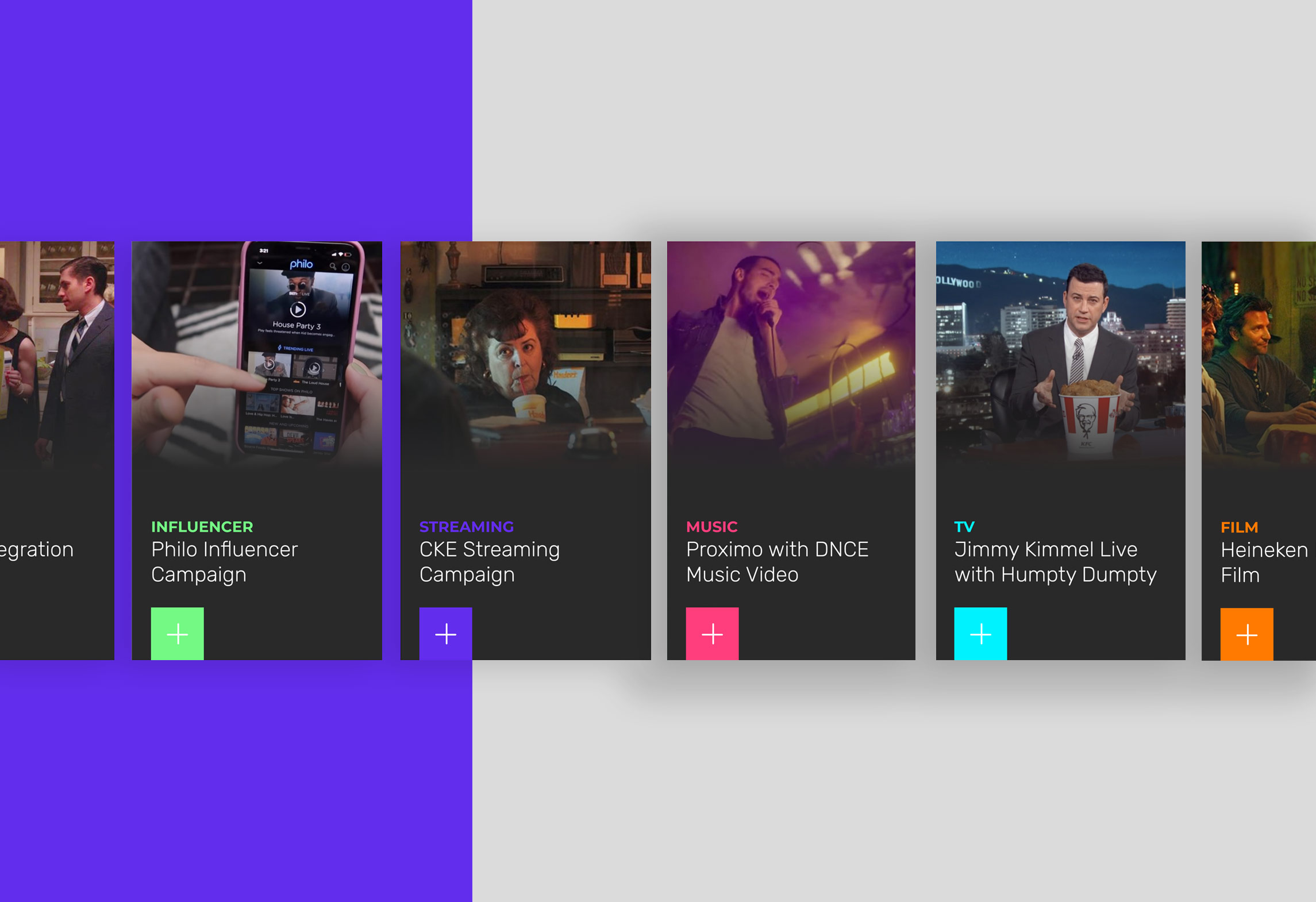
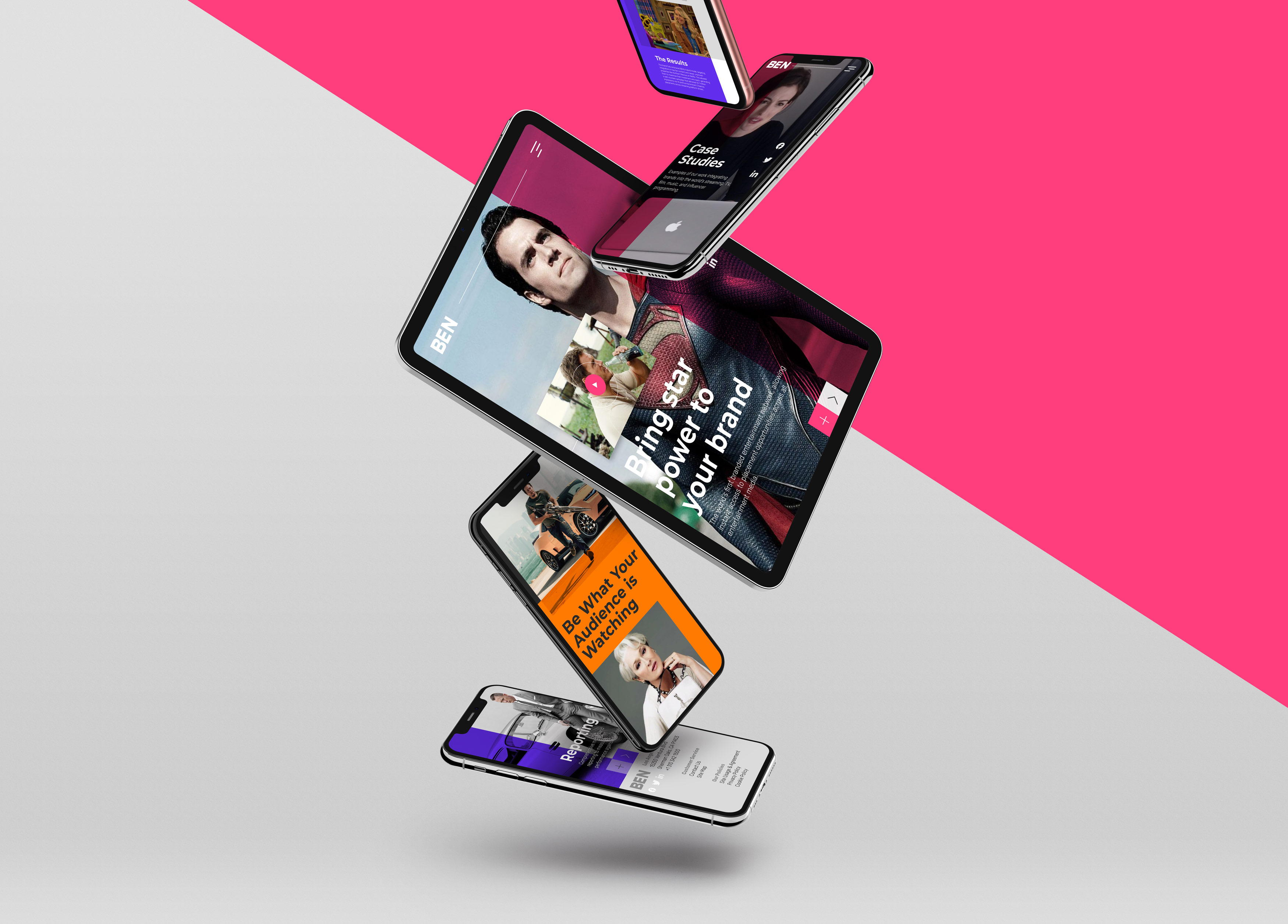
Wireframes, Responsiveness, UI and UX, Prototyping… This was a project that helped me to take all that new knowledge and apply it. A project with an obvious thought behind in terms of imagery, colour and composition, that was trying to fulfil clients expectations and bring something compelling to the brand, but with that extra element that helped me to understand digital design nowadays: being practical and experimental about how users would experience the journey through the website in different devices, how to wireframe and design in new and powerful tools like Figma or Sketch that allow plenty of flexibility when prototyping and even animating (and how that changes the relationship with the developer), or how to create a functional design system full of useful components. And that’s just the tip of the iceberg of how much I learned and I’m still learning about digital design.
Pushing the boundaries to learn exciting new things is a way of succeeding too. It’s an eye-opening experience to new forms of creativity while that knowledge gained can be applied to other pitches and future clients that might be ready for it. Success as a powerful tool to take design to the next level.


