Article Ten
Never the same
old story
Nothing more exciting -and scary- than art directing the rebrand of the company you’re working for. Establishing human and professional connections for a long time with co-workers makes even harder to find the right image that would make everyone feel part of the change. But the rewards can be infinite too.
Article Ten is a London-based agency bringing together integrated campaigns and creative work from different fields like digital, branding, video or events. When, as a part of the restructure of the management team and a new vision based on global success was unveiled, I was asked to come up with some initial ideas of how the new Article Ten could look. Right straight way, I knew where the company should visually go.
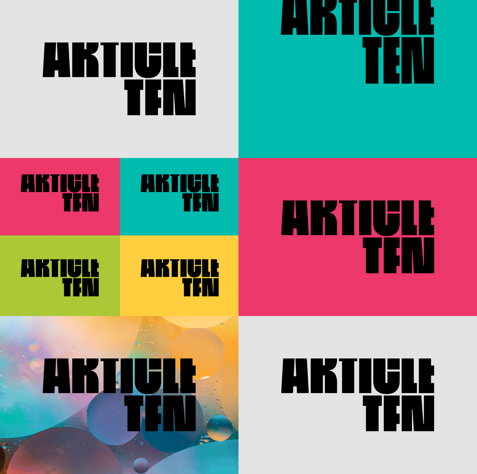
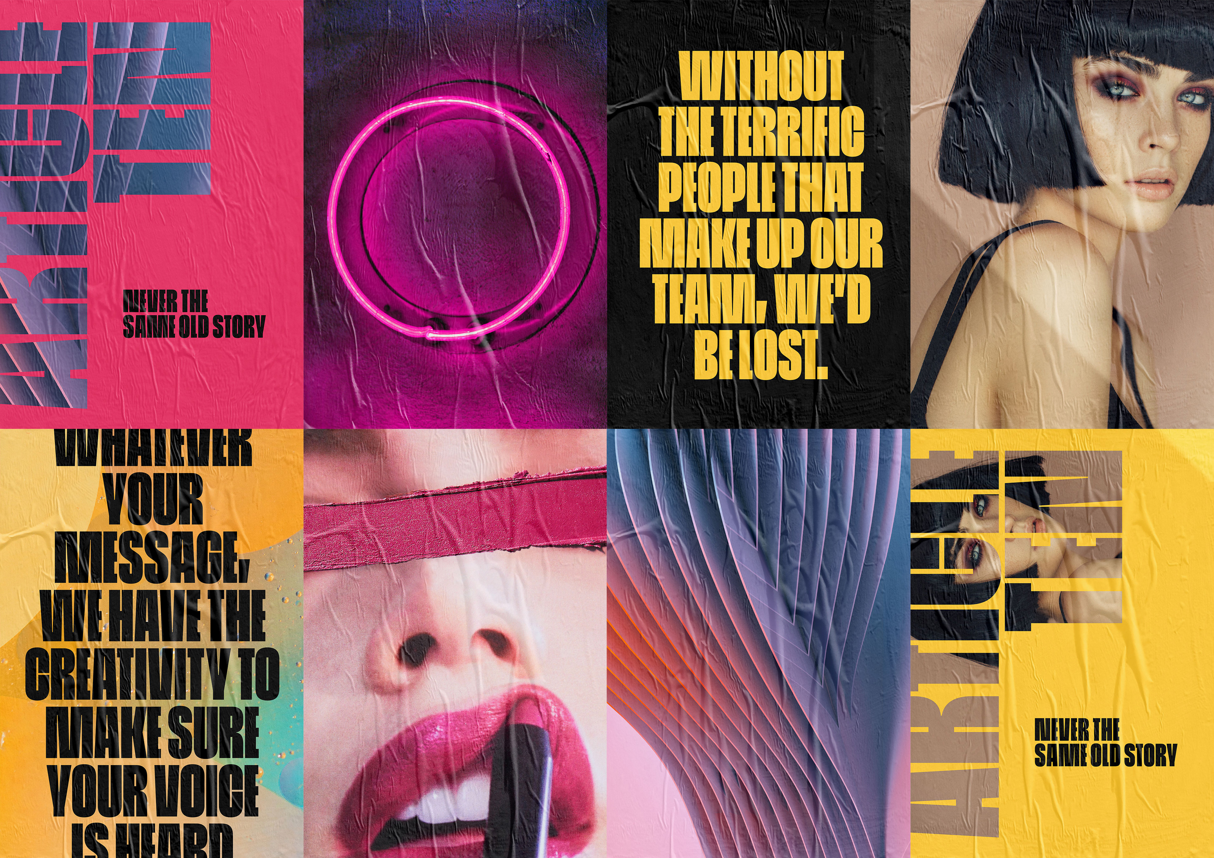
Bold and free. Article Ten takes its name from the European Convention of Human Rights. It means freedom of speech. This is a young team in constant growth, keen to explore and learn new things and move into different directions. Every day is a different story to tell, and a different project to take care of, and that capacity to evolve and transform needed to be a strong part of the rebrand. Working for the company for the last 3 years makes easier to understand the legacy, highlight the strengths and achievements and evaluate the things that can be improved.
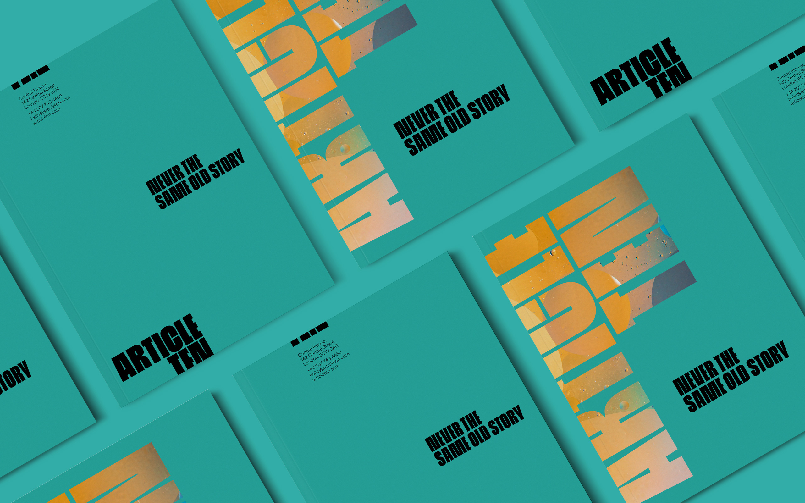
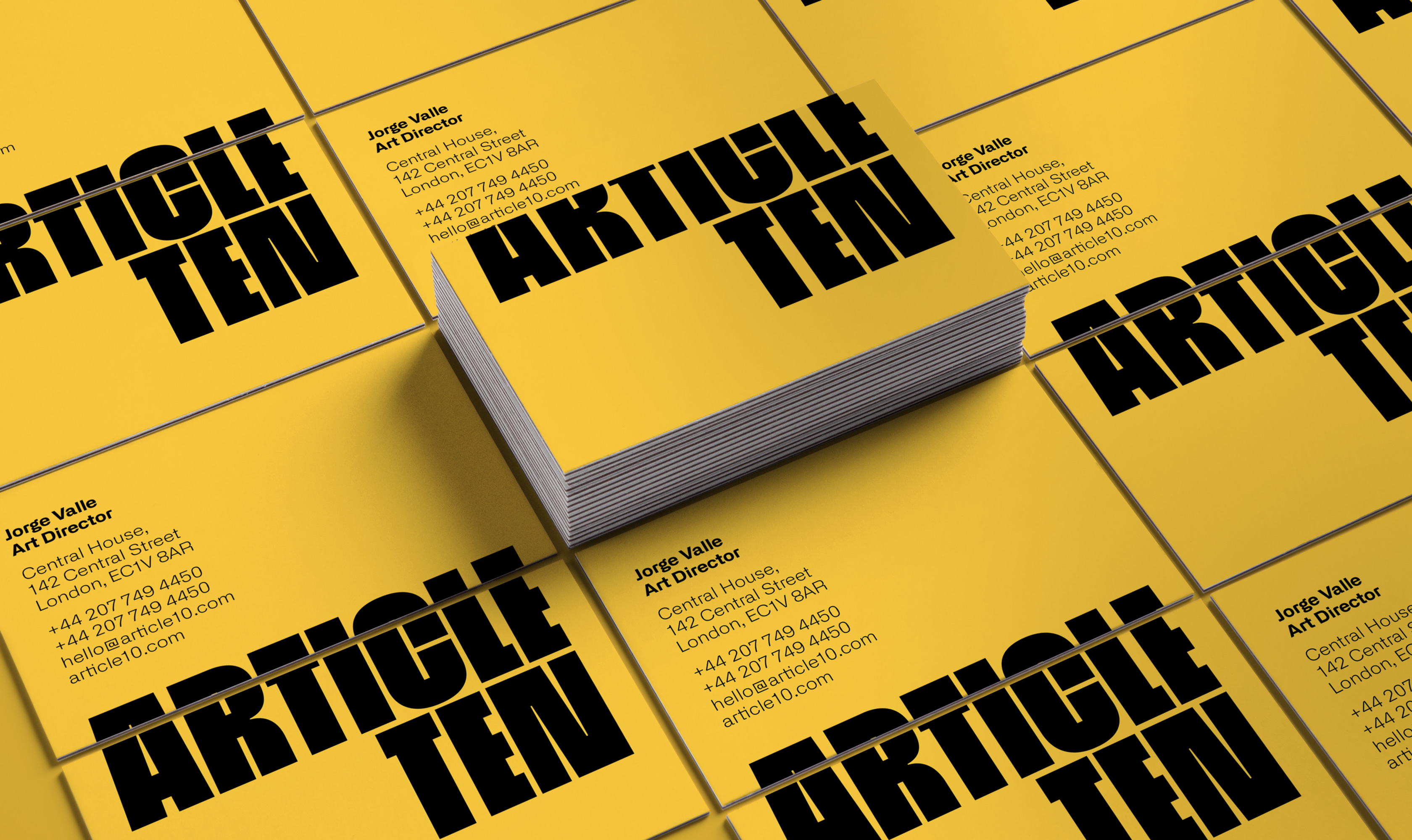
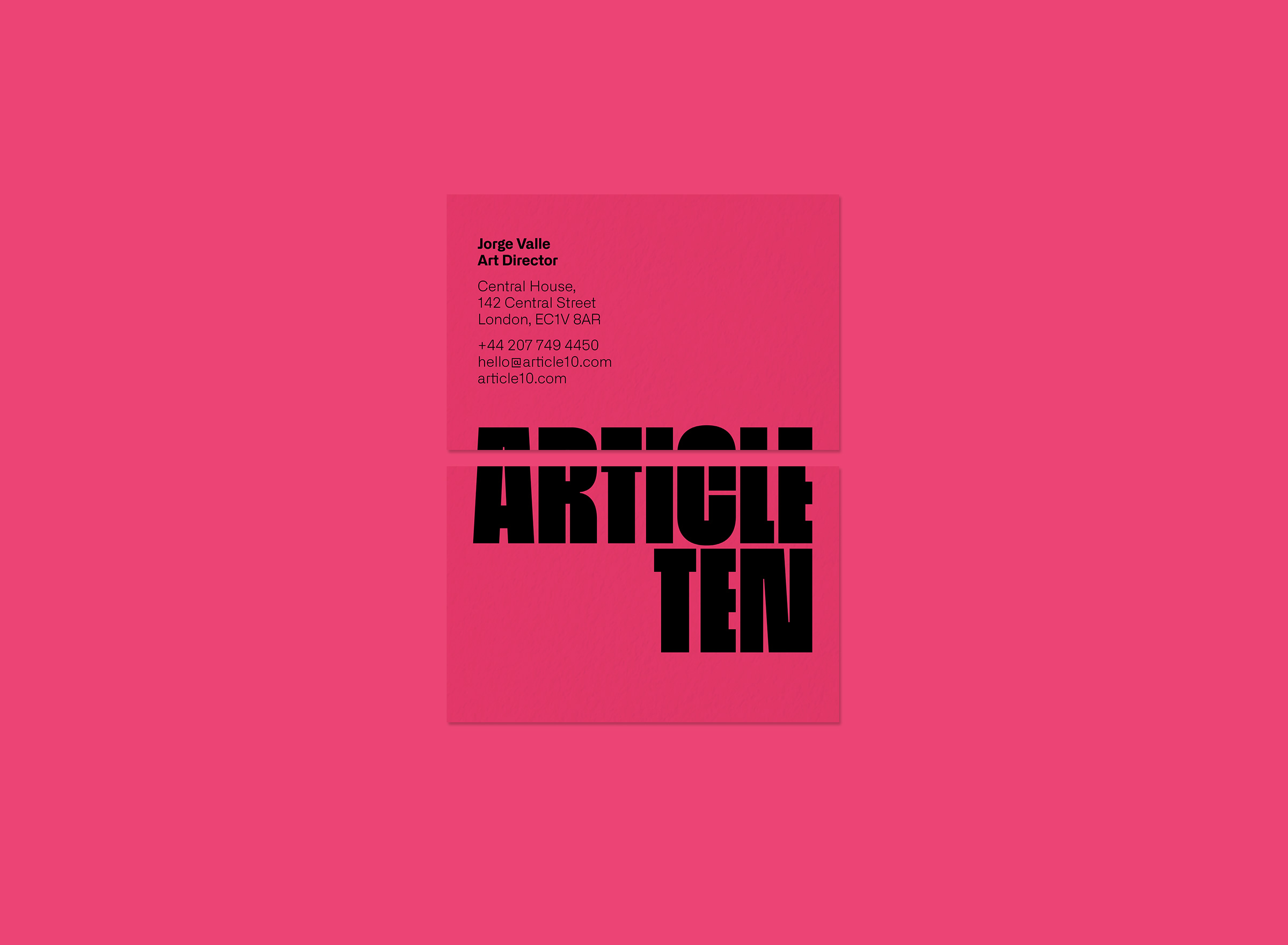
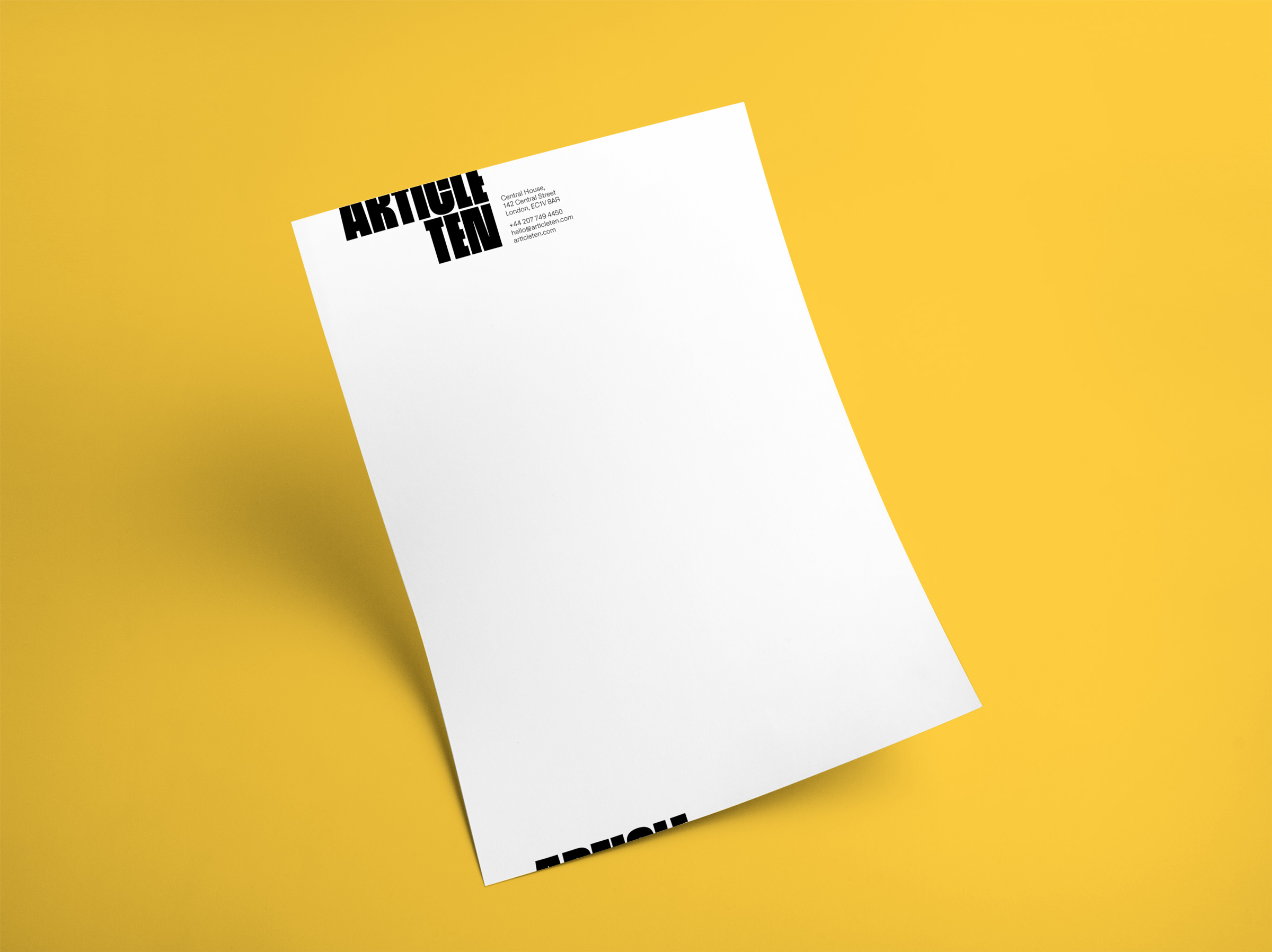
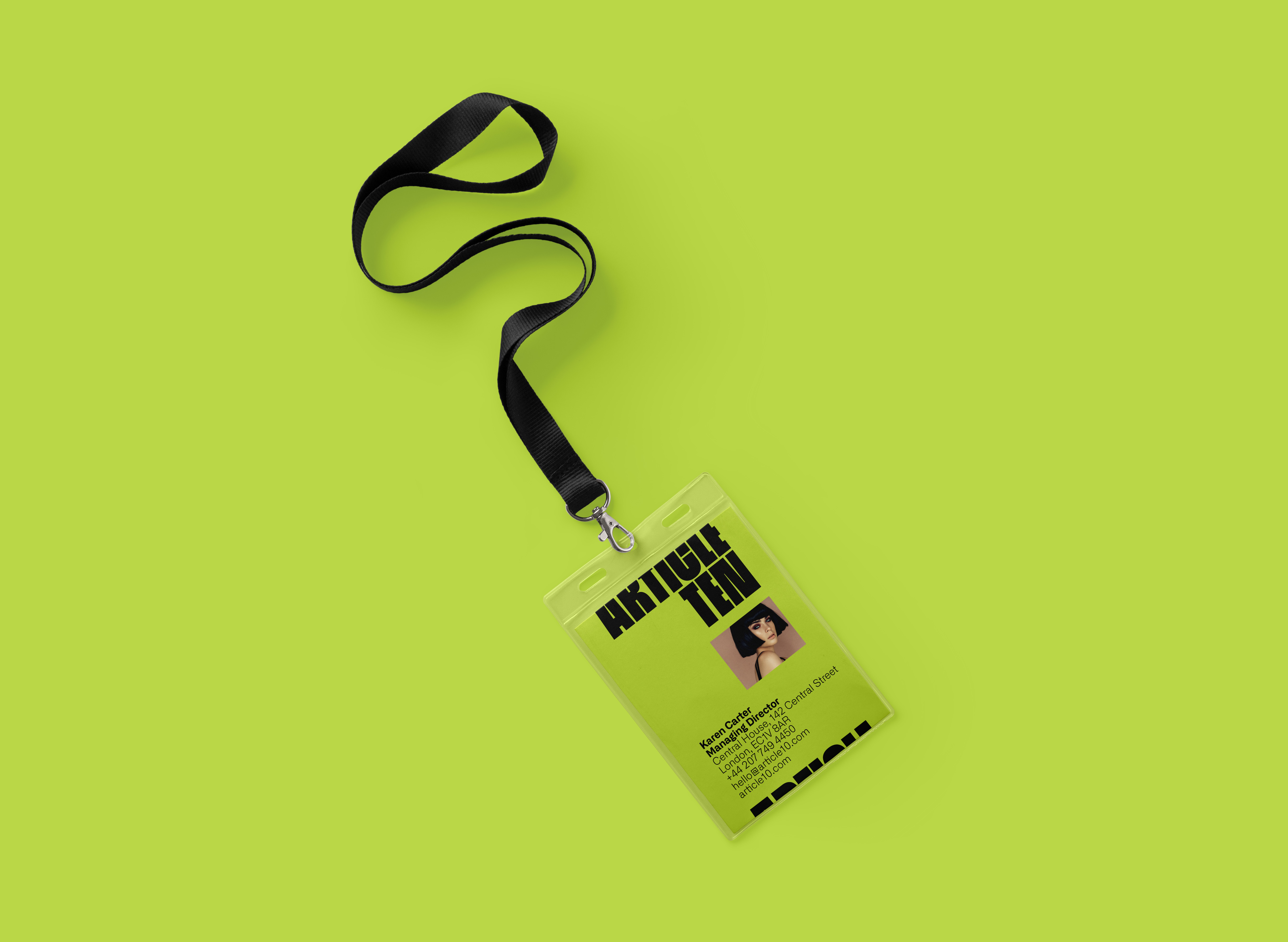
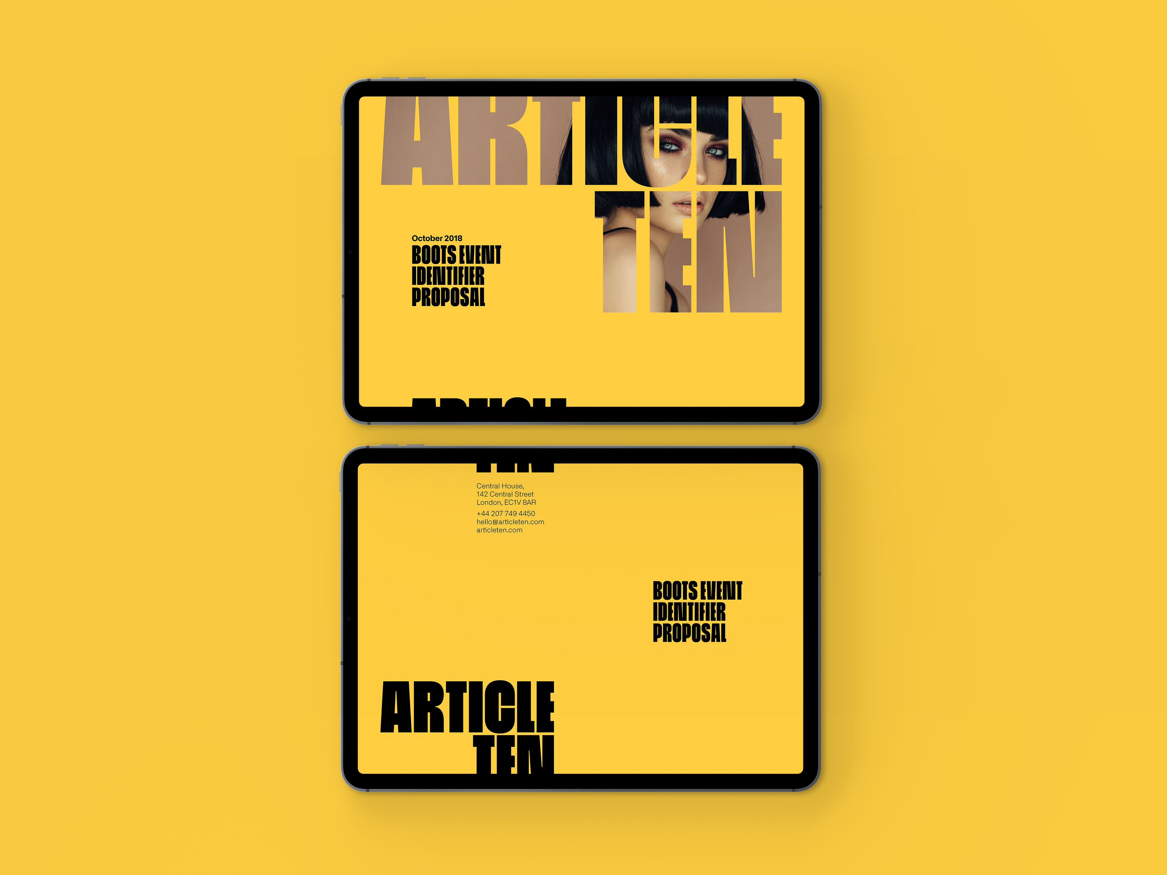
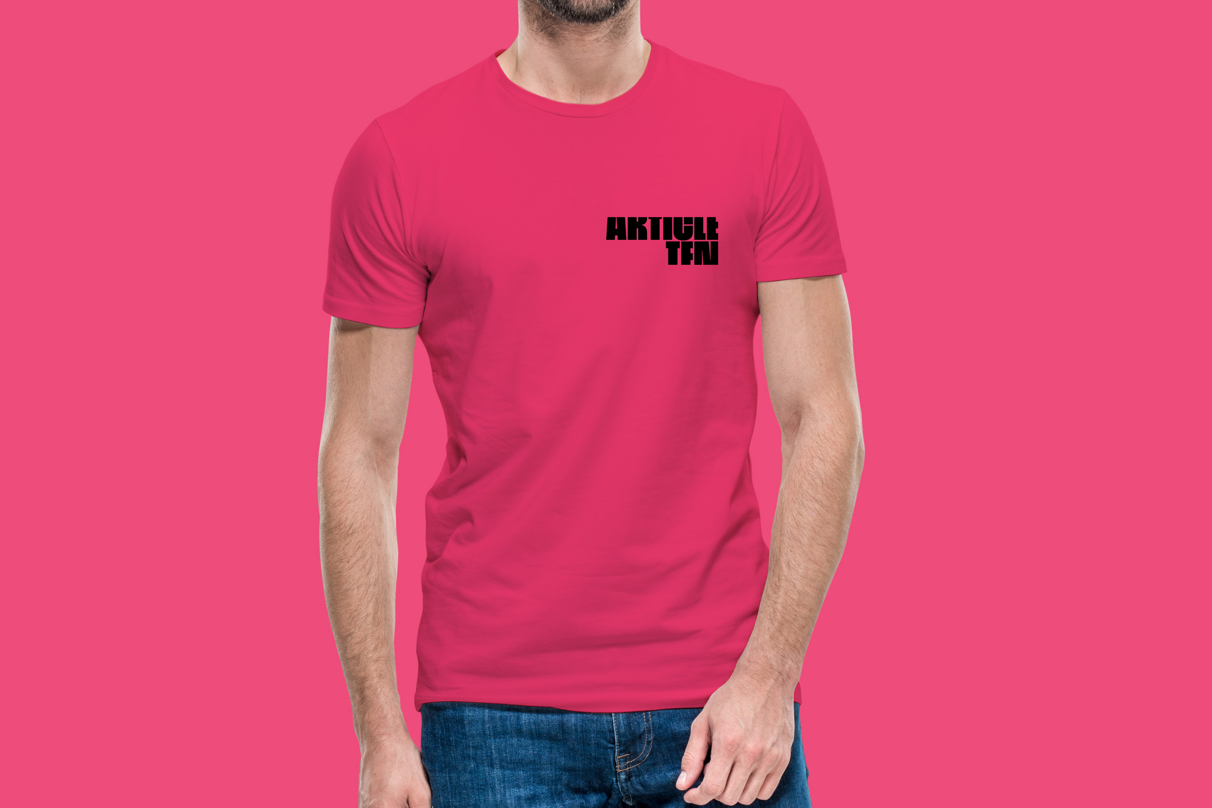
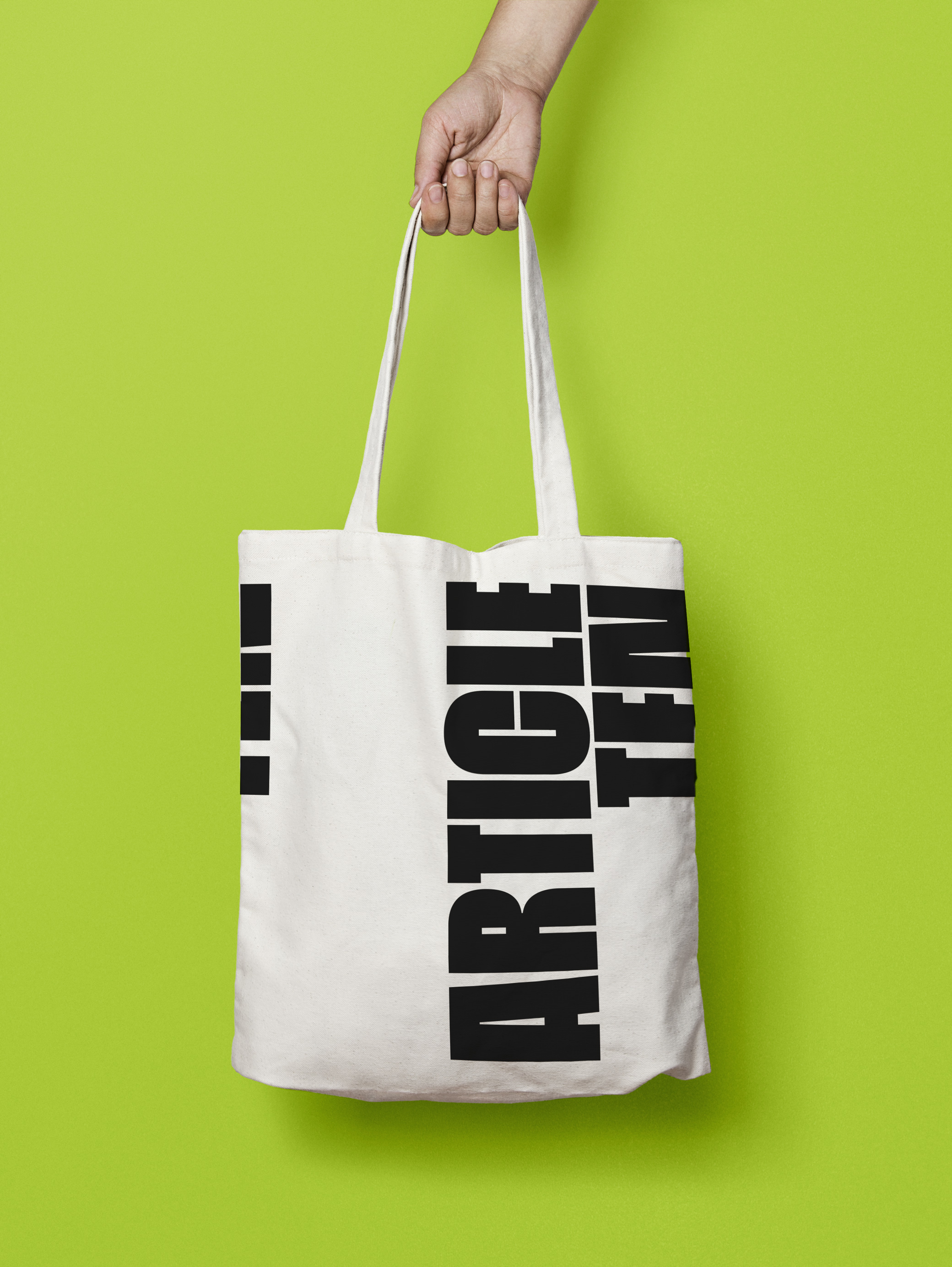
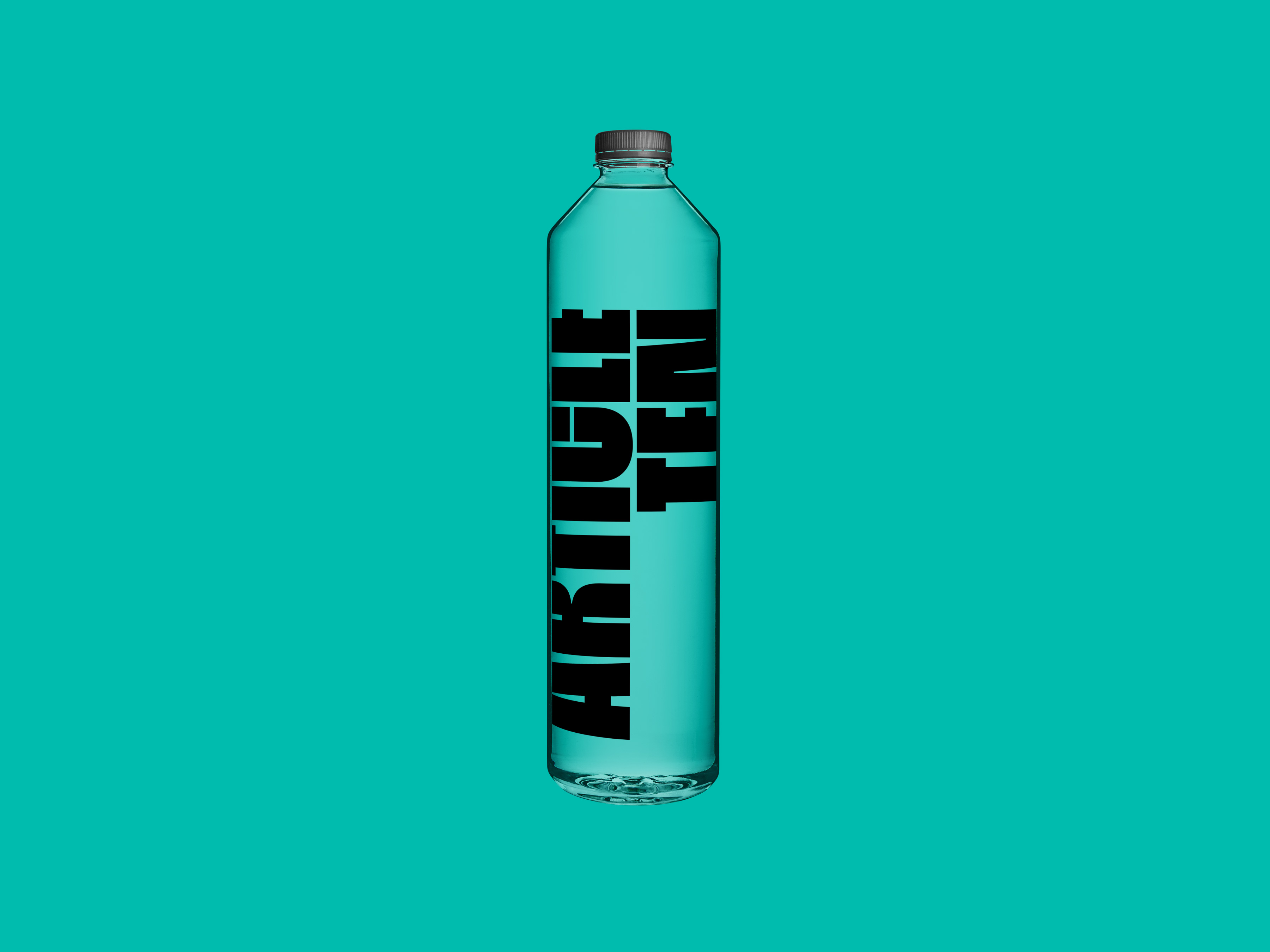
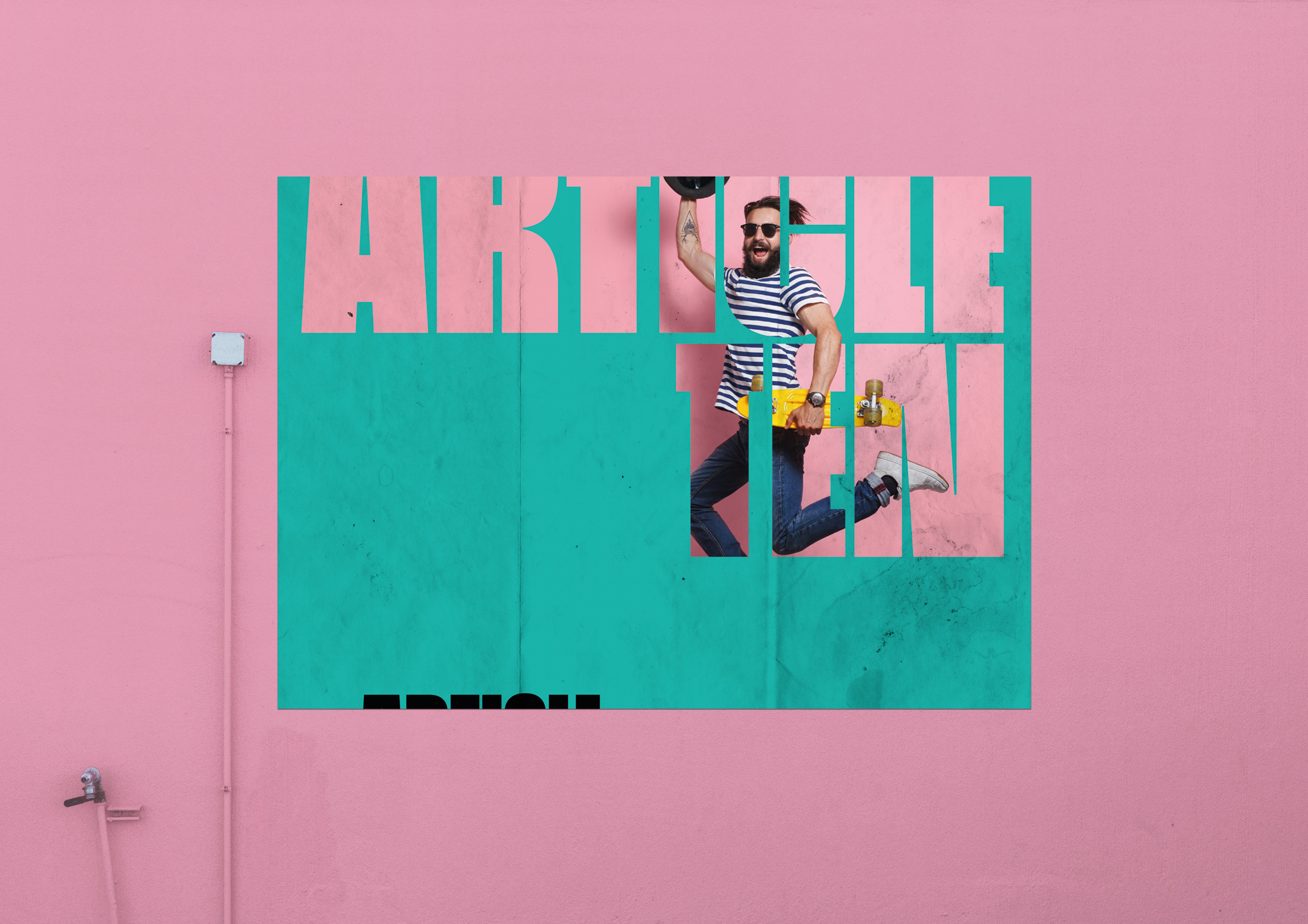
That’s the reason why, while working on the logo, the idea of avoiding a static image came from. The logo – and the whole new brand- needed, primarily, to be free, used more as a vehicle capable of transporting ideas and creativity than as the classic notion of what a logo should be. The new Article Ten logo is not restricted by place or space, and works as a window to the world of imagery and inspiration.
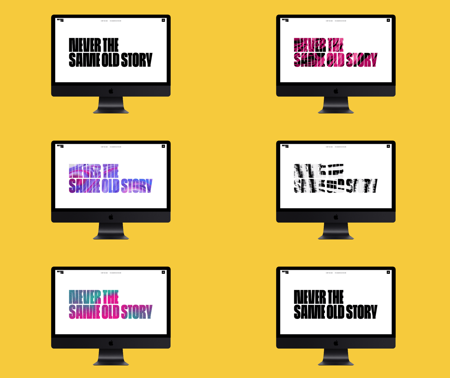
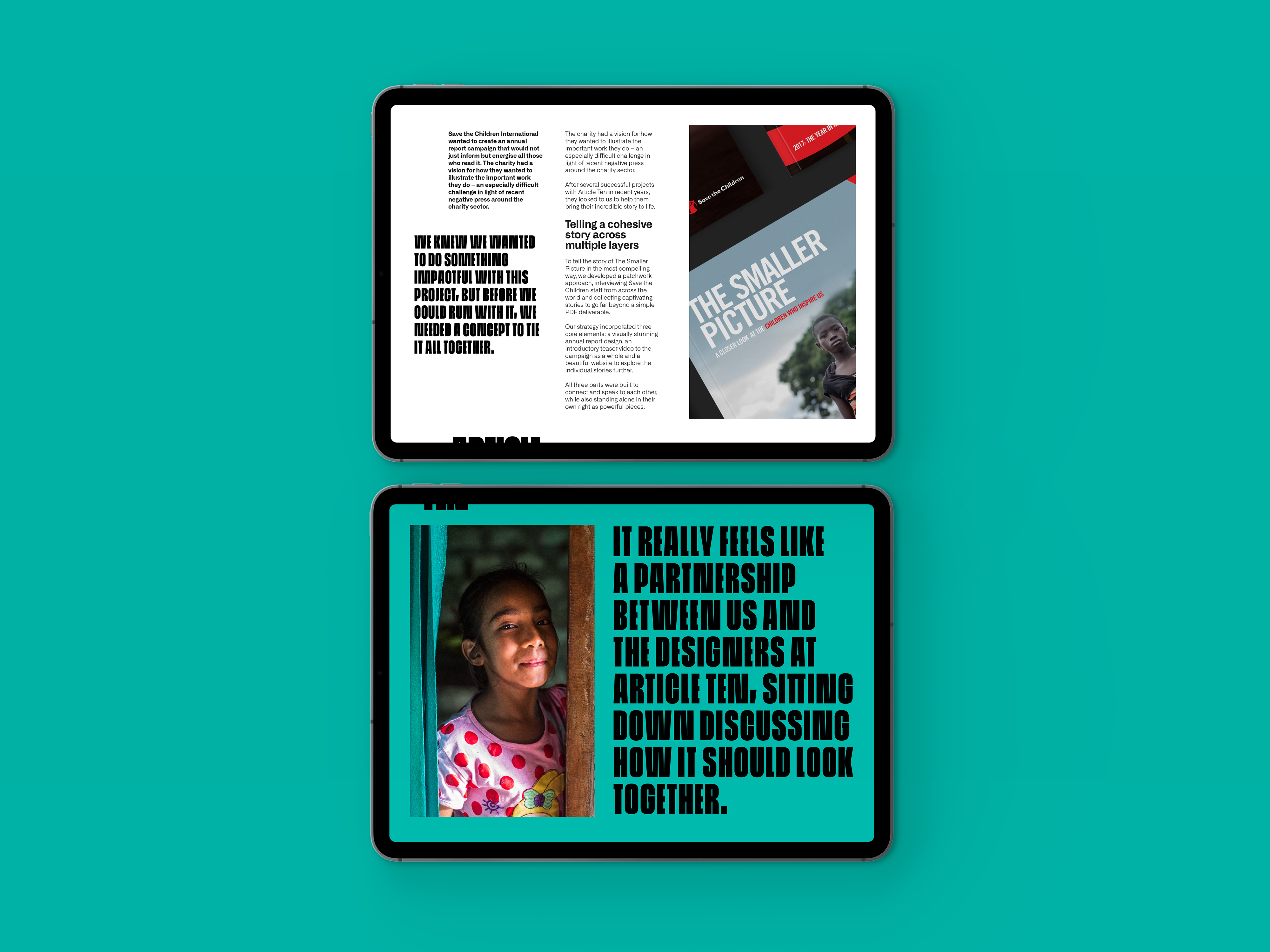
But a change like this it’s a bold move too, and that’s how the new brand was envisioned. The new Article Ten needed to look strong and unapologetic. A company proud of their work and the people who works there, and who is not afraid of being seeing as ambitious, progressive and determined. Everything, from the typeface to the colour palette, must evoke that bold feeling, an agency ready to evolve and express in many different and exciting ways.


